Daily Projects: 36 Days of Type, Part 2

36 Days of Type continues with the letters E through H. The composition of the H is my favourite in this batch of four. I’ve actually been composing, photographing, and processing these in batches of seven at a time. It takes a couple hours of work to do this but it’s more efficient to work this way than one at a time.

I cut a few new patterns to use starting with the H, and also began incorporating a series of hand-cut half-circles in shades of blue that have been languishing in a drawer for years. 


Daily Projects: 36 Days of Type

On Monday the latest edition of 36 Days of Type went live for the ninth year, and for the first time I am participating. I had planned way ahead to take part because I thought it would be an excellent opportunity to play and explore new ideas. 

I decided early on that I would not hand make everything and definitely not create finished paper-crafted pieces. It’s just too much to take on for a daily project. I decided to use my digital cutter to create many of the pattern layers, and I cut them each in more than one colour. The letter forms are hand-cut because I needed them to be perfect, and the digital cutter is far from perfect. It too often has sudden meltdowns that lead to mis-cut patterns and butchered paper. 

I compose each letter design using four or five layers with foam core spacers in between each, take a few photos, and then pull it apart to create the next letter. I’m working with six colours, and cycling through four of those colours as the top letter layers – red, violet, indigo, and bright blue. These are the first four of my upcoming 26 letters and 10 numbers.


In case you are wondering, the inner shapes of the A, B and D are floating there on tiny pieces of foam core. 

I was looking for a project to energize, challenge, and inspire me, and this is absolutely doing the job. It’s an incredible amount of work, even without hand-making everything, but so worth it.


Paper Weight: Works in Paper by Elsa Mora

Elsa Mora is a multi-disciplinary Cuban-America artist and illustrator. I count her amongst my list of favourite artists for her ability to work in every type of material, and for her brilliant and unique craftswomanship with paper. I was thrilled to learn of her show in Eugene Oregon at the Jordan Schnitzer Museum of Art that opened in late August, and knew it was my best opportunity to see her work in person.

Boris and I made a long weekend road trip out of the visit and used Portland as our base rather than Eugene. The Jordan Schnitzer Museum of Art is located on the beautiful University of Oregon Campus and is a gorgeous old brick building (I forgot to take a photo).

Elsa Mora at the Jordan Schnitzer Museum of Art

Elsa Mora at the Jordan Schnitzer Museum of Art

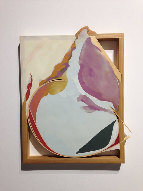
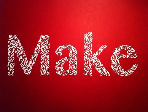
The work in the Paper Weight exhibition explores different themes around the human mind, including mental health issues, and is broken into six sections representing cognitive categories: consciousness, perception, thinking, judgement, language, and memory. Every piece is highly detailed and is made from paper. I was so excited and inspired to see these up close and in person.

Elsa Mora at the Jordan Schnitzer Museum of Art

Elsa Mora at the Jordan Schnitzer Museum of Art

Elsa Mora at the Jordan Schnitzer Museum of Art

Elsa Mora at the Jordan Schnitzer Museum of Art

Untitled

Untitled

Some of my favourite pieces were contained within two glass cases in the centre of the room. One Hundred and One Notions is a collection of small paper sculptures each representing a mental disorder with the overall theme of perception. I think these objects really showcase Elsa Mora’s skill with manipulating paper.

The museum published an excellent hard cover catalogue to accompany the show, and it includes photos of all the work and an interview with the artist herself. It’s a terrific addition to my collection of paper art books.

Elsa Mora at the Jordan Schnitzer Museum of Art

Elsa Mora at the Jordan Schnitzer Museum of Art

Elsa Mora at the Jordan Schnitzer Museum of Art

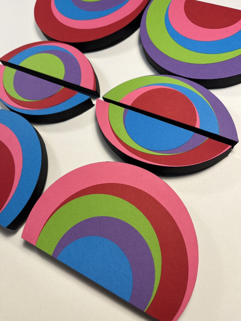
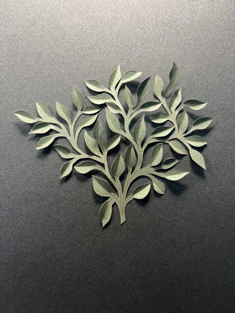
The photos below were taken in the gorgeous inner courtyard at Jordan Schnitzer Museum, which had mid-afternoon sun pouring in at the time.

Elsa Mora at the Jordan Schnitzer Museum of Art

Elsa Mora at the Jordan Schnitzer Museum of Art

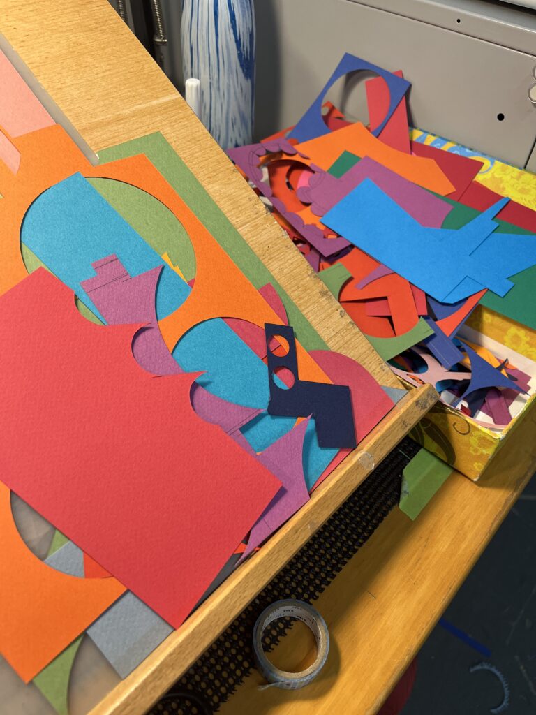
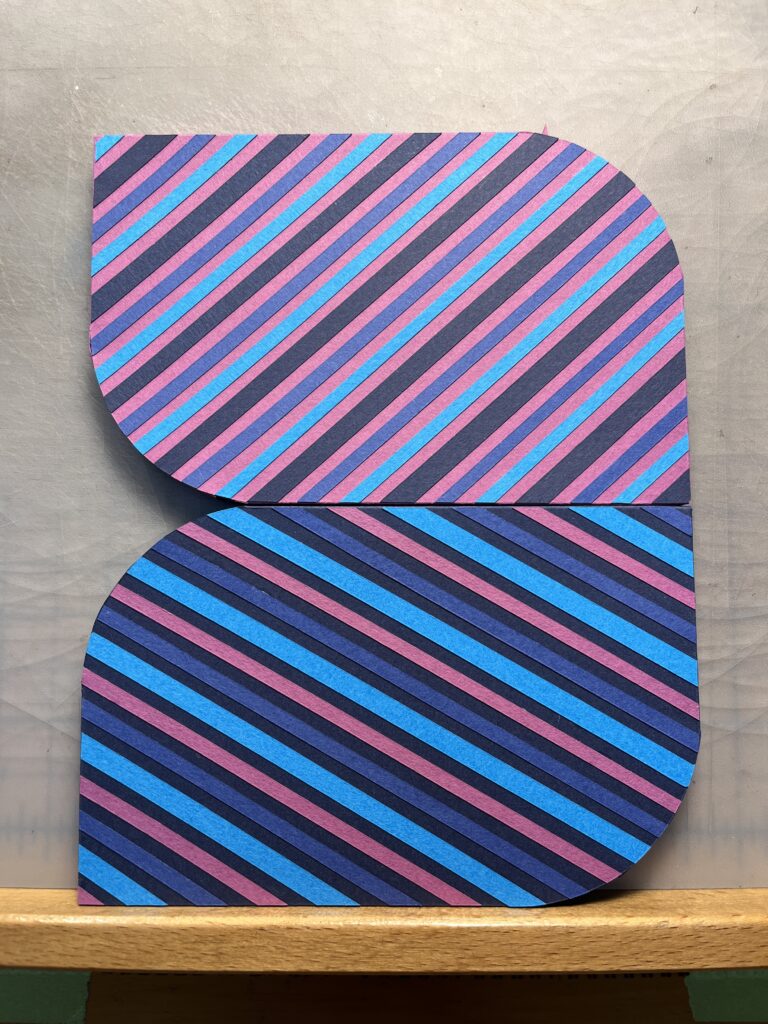
The trip took an epic amount of travel to get there and back, but I think it was worth it. I came away from the show feeling inspired, and driven to push my own paper work in new ways. Paper Weight continues until January 20, 2019.

A Canadian Bestiary by Janet Macpherson

This exhibition at the Gardiner Museum was on my must-see list while in Toronto, and it did not disappoint. It wowed and impressed. Janet Macpherson creates weird and wonderful hybrid animals in porcelain cast from all sort of objects in the form of animals, such as toys, decoys, masks, etc. The exhibition is made up of four groups of installations and explores the Canadian experience in different ways.

Janet Macpherson: A Canadian Bestiary

Janet Macpherson: A Canadian Bestiary

The carved deer head and legs were among my favourite pieces. I think they were glazed in black and then the intricate leaf pattern was carved into the surface to reveal the white porcelain underneath.

Janet Macpherson: A Canadian Bestiary

Janet Macpherson: A Canadian Bestiary

Janet Macpherson: A Canadian Bestiary
The installation below was the most fascinating of the four because the viewer needs to take a long time looking at the many strange combinations of animals that make up the individual pieces. My favourites (not pictured here) were a polar bear body with the head of a song bird, and one with the body of an eagle combined with the head of a horse.

Janet Macpherson: A Canadian Bestiary

Janet Macpherson: A Canadian Bestiary

Janet Macpherson: A Canadian Bestiary

Janet Macpherson: A Canadian Bestiary

Such an inspiring exhibition to see! The show continues at the Gardiner Museum until May 22, 2017, and was commissioned to celebrate the 150th anniversary of Confederation. View more photos of the exhibition here.

Scenes from the 2016 Seattle Art Fair

Boris and I did a short trip to Seattle over the weekend to visit friends, but I also timed it to coincide with the Seattle Art Fair.  This was my first experience attending a large art fair like this, and it was AMAZING! There was so much to see that my brain almost overloaded in the first five minutes. I started out rushing through because I was SO EXCITED, but then calmed myself down and took it at a slower pace.

I did not take as many photos as I’d wanted because I didn’t trust my battery to hold out for the few hours I was going to wandering around. So this is a small selection of pieces of art I liked or found interesting. There is way more I wish I could have photographed to share.

Seattle Art Fair 2016
Skylar Fein

Seattle Art Fair 2016
Paul Villinski

Seattle Art Fair 2016
Keun Young Park

Seattle Art Fair 2016
Christian Maychak

Seattle Art Fair 2016
Beth Cavener

Seattle Art Fair 2016
(Did not get the artist for this one.)

Seattle Art Fair 2016
Markus Linnenbrink

Seattle Art Fair 2016
Phil Shaw

Seattle Art Fair 2016
Kymia Nawabi

Seattle Art Fair 2016
Christopher David White

Seattle Art Fair 2016
Timothy Cummings

Seattle Art Fair 2016
Elisheva Biernoff

Seattle Art Fair 2016
Nancy Mintz

Seattle Art Fair 2016
Kate MacDowell

Visiting the Seattle Art Fair was so inspiring but also humbling. It was a good reminder that I need to level up the quality and quantity of my work if I ever hope to be included in an event like that. I don’t feel my work is currently good enough, but I could be if I work harder.

A Whirlwind Trip to Seattle

A few weeks ago I decided to do a quick trip to Seattle in order to catch Morgan Brig’s new show at Patricia Rovzar Gallery before it closed at the end of June. I’ve admired her work for a few years, ever since coming across the gallery and her work while wandering the streets after Gnomedex in 2009.

These are three of many new pieces of Brig’s latest work. I really like the series of boats on wheels she’s created. Check out more of Morgan Brig’s work on her web site.

Work by Morgan Brig

Work by Morgan Brigg

Work by Morgan Brigg

It was only a twenty-four hour visit to Seattle and my main stop beside Patricia Rovzar Gallery was the Seattle Art Museum to see the Vogel show.

Fifty Works for Fifty States is an exhibition of works donated to the museum from the collection of Dorothy and Herbert Vogel. Their collection of art is so large that they’ve donated fifty works to one art institute or museum in each of the fifty states. The display at SAM was mixed in with existing work from the collection of a similar nature. The show did not grab me as much as other things in the museum did.

Costumes

Beautiful tree and cups

A display of ceramics

SAM’s displays of their permanent collection are always engaging, no matter how many times I’ve seen them. They even manage to make ceramics compelling, which is an area of items I normally find rather boring. I wandered through previously unseen corners of the museum and came across the two murals pictured below. They were a fun surprise and both play with perspective in interesting ways.

Eye mural

Crazy face mural

I also found interesting art on the streets, which is something I haven’t found much of on past visits to Seattle. I love the mural of the man in a wolf mask. The leaves coming in from the top corner of the photo are real but blend nicely into the pasteup.

Wolf mask

Famous Faces of Seattle mural

It was a lot of inspiration packed into a short visit, and it was just the thing I needed to get inspired. Thanks Seattle.

Make: Cut Paper Typography

After my initial explorations into cut paper typography with the word Art a few weeks ago I decided to choose a few more words to work with. Make goes very well with Art, and after today Create will be added to the series.

Make

Make

To give you a sense of scale this is an 8.5″ x 11″ piece of red card stock, and the letters are between 2.25″ to 3″ high. I create the word in photoshop first, print it out and use this as a template to draw an outline of the letters. All the cutting of shapes is done freehand.

Make

Make

I enjoy trying to form the letters from smaller shapes. It’s actually pretty challenging because I am working so small. I think it’s an excellent exercise to refine my paper cutting technique even further.

Make

Make

Other than the word “Create” can you suggest other short words that would make a good addition to this series? I’m open to requests.

Cut Paper Typography

I’ve long admired the work of Elsa Mora, a Cuban artist living in LA who works in various mediums including paper cutting. I was looking at her website earlier this week as a way to jog my thinking on how to write about my own paper cut work, and came across her new site, Art Is A Way.

Paper cut typography

It’s a lovely little side project of creating artwork using the word Art, and she’s invited people to join her. I don’t normally have much interest in exploring typography in my own work, but the project inspired me to experiment with typography created in my style of cut paper.

Paper cut typography-4

Paper cut typography-3

I chose a font in photoshop, Tamil NM in bold, made it large enough to nicely fill an 8.5″ x 11″ page and printed it out. I used this as a template to trace the outline of the letters first and then freehand cut all shapes. It was really fun to do, and has me pondering more potential work using type.

Paper cut typography-2

Paper cut typography

If you’re interested in creating your own work of the word Art, check out the about page of Art Is A Way for details.

Paper Cut Work: New Work Available for Purchase

It was only after the Eastside Culture Crawl ended that I realized I hadn’t as yet properly documented some of my recent work. So while I was busy documenting the display I’d put together, I also spent some time photographing individual pieces. It’s so handy to be a photographer with lights, on top of everything else that I do.

These are five in a series of seven white paper cut designs I created through freehand paper cutting techniques. I do not draw anything beforehand. I have a spontaneous and iterative process using a repeating crescent shape to create slightly different overall forms for each piece. I have yet to give the series a name, but they bring to mind things like wind, waves, and even microscopic life forms.

White Paper Cut Series

Framed: 13″ x 16″ | $350

White Paper Cut Series

Framed: 13″ x 16″ | $350

White Paper Cut Series

Framed: 13″ x 16″ | $350

White Paper Cut Series

Framed: 13″ x 16″ | $350

White Paper Cut Series

Framed: 13″ x 16″ | $350

The work below are larger pieces than the white series and there are only two at the moment. I call these three-dimensional paper cutting because I cut and fold the shape upwards rather than removing it. Both are unframed on 19″ x 25″ Strathmore paper.

Paper Cut Work (SOLD)
Paper Cut Work - detail (SOLD)

Unframed: 19″ x 25″ | SOLD

Paper Cut Work
Paper Cut Work - detail

Unframed: 19″ x 25″ | $300

This new work was a big hit on Culture Crawl weekend, with many people wondering at my laser-like precision knife skills.

All work is available for sale, and enquiries by email are welcome.

Commissioned Work: Paper Anniversary

I’ve been holding back recently on sharing a few commissioned projects, because I’ve had to wait on clients making them public first. This particular paper cut piece was commissioned by a dear friend as a secret anniversary gift to his wife. Since the gift is now in her hands, I can share it with you.

Paper being the traditional theme for gifts given in celebration of a first wedding anniversary, I was the perfect person to come up with a unique token of affection. My starting point was to create something from paper and take inspiration from the family Coat of Arms the couple had created for their wedding last year.

One year anniversary Commission

I chose to create an abstract composition with layers and textures of paper, and minimal colour. The shield with intertwined letters (representing both their last names) was taken directly from the Coat of Arms. I used a print out of this as the template to cut out the letters, which I then backed with black card stock to help the S and T stand out boldly against the white.

One year anniversary Commission

One year anniversary Commission-2

The background is a three-dimensional design freehand cut from a single sheet of card stock and backed with black paper. The crest is attached to float on top. The foreground part of the work is also one sheet of white card stock, but for this one I drew out the leaves before cutting. I almost never pre-draw a paper cut design but in this instance I needed to plan it out first and then cut.

One year anniversary Commission-3

Once each piece of the composition was completed I mounted them into a wood cradle panel painted with a light wash of white acrylic paint, and it was ready to hang in its new home.

Happy Anniversary to my dear friends James and Monique. May there be many happy years to come…