November Long Weekend on Bowen Island

The usual series of lovely scenes from Bowen Island. It rained heavily but when the weather cleared we had blue skies, bright sun, and colder weather. It feels like winter now.

On the ferry to Bowen Island

Near the beaver dam

Elephant tree

Blue skies above the forest

Anna's Hummingbird

The Anna’s Hummingbird was a frequent visitor to the three feeders Anne has positioned around the windows of the house. I feel lucky to have gotten a few good photos with my iPhone while he was feeding. Most of the time these birds are too speedy to photograph with a camera phone.

Paper Cut Work: Propeller

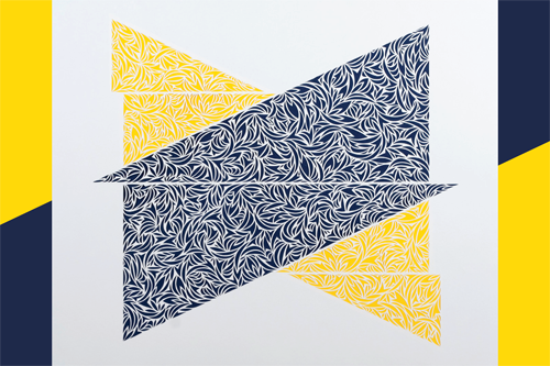
This is my favourite piece that I’ve made for the Eastside Culture Crawl. I love how the three larger shapes fit together, the flow of the small cut shapes, and the bright colours. I’ve titled this piece, Propeller.

paper cut-2

paper cut-3

As with all of the others for this series, the work is cut from a 14″ x 17″ piece of white drawing paper, and mounted to a piece of 16″ x 20″ Canson Mi-teintes paper. It’s all framed and ready for the Crawl, and I can’t wait to share it in person with people.

paper cut-4

paper cut

My show at Kafka continues until December 1st, and the Eastside Culture Crawl is coming up fast on November 20th to 23rd. And then I’m taking a break….

Compulsory Podcast With Kim Werker

I love how my friend Kim Werker has gone from talking about starting a podcast of her own, to making the first episode all in about a week. The podcast is called, Compulsory, and in each episode Kim will talk to a different person about the things they feel compelled to make.

The First episode features me and a conversation in which I talk a lot about my brain, tediousness, repetition, and focus. Have a listen and let Kim know what you think. You can also subscribe to Compulsory in iTunes.

Paper Cut Work: Pinwheel

I was thinking about a pinwheel when I started this piece and though it ended up not becoming much like an actual pinwheel I am keeping it as the name. When I work on these I often can’t tell how the larger form is going to work until most of the paper cutting is done.

paper cut-6

paper cut-7

The work is a 14″ x 17″ paper cut mounted onto 16″ x 20″ Canson Mi-teintes grey paper. I added the blue circle because as I was framing this I felt it needed a contrasting shape and colour to make the design stronger.

paper cut-8

paper cut-5

This is part of the same series of work I created for my show at Kafka, but it will be on display at my studio location during the Eastside Culture Crawl, November 20th to 23rd.

Hot Talks @ Hot Art Wet City: Eastside Culture Crawl Artists

For our November edition of Hot Talks we’ve partnered with the Eastside Culture Crawl to present an evening of short talks by eight artists participating in this year’s Crawl. It was a difficult selection process choosing from among the hundreds of talented artists who take part in the studio tour every year, but I made sure to choose a wide variety of disciplines.

Our speakers for the evening are Michelle Sirois Silver, Jon Shaw, Holly Cruise, Claire Madill, Patsy Kay Kolesar, Reilly Lievers, David Robinson, and Robin Ripley.

ECC-HAWC-HOTTALKS

Each artist will share a bit about their process and work in a short “Show & Tell” style talk on November 13th at 7pm. Tickets are by donation and are available for purchase through Eventbrite.

Hot Talks: Eastside Culture Crawl
Hot Art Wet City
Date: November 13th, 2014
Time: Doors 6:30, talk 7pm
Address: 2206 Main Street (at 6th Ave), Vancouver

Remaking and Upcycling

I don’t know why, but I’ve been intimidated about tackling even the simplest DIY project around the house, and there are a few I’ve been contemplating for YEARS. Two weekends ago I decided to finally go for it, and started working on redoing two small projects, a wooden shelf in the bathroom, and a wooden shoeshine box. I didn’t have a clear idea for either of them, but I wanted each to be fun and colourful.

The shelf started out as an ugly dark green, and the shoeshine box started out as a beaten up object covered in greasy black polish. Neither were in great shape so I didn’t want to spend much money on the redo. I chose acrylic paint rather than latex to save money, and it seems to have worked out just fine.

Upcycled shelf

I regret not taking “before” photos of these two objects, but at the time I didn’t really care about sharing a before and after comparison. I painted many coats of white paint on each, and then had to decide what to do. I made up the designs as I went, using green painters tape to create the lines. There was a bit of clean up after I removed all of the tape, in areas where the paint snuck under.

Upcycled shoeshine box

Both pieces reside in our bathroom as organizers, and they are a welcome splash of colour to the decor. Now I’m considering my next DIY upcycling project…

Paper Cut Dioramas For So Nice

This is work I have been sitting on for months while I waited for the advertisements to be approved by the client and go to print. I was commissioned in June by ReThink Communications to cut and fabricate by hand two illustrated scenes created from ten layers of paper to advertise So Nice soy and almond milk.

Around the time I completed my part of the work I shared two tiny details of a bird and a maple leaf, one from each scene. It gives an idea of the scale I was working at, though both scenes once assembled were approximately 9.75″ high, 3.75″ wide, and 8″ long.

So Nice work
Work in progress of the Yoga pose diorama, just after all the layers were cut.

So Nice work-6
So Nice work-3
Work in progress of the Yoga pose diorama, fully assembled in my studio.

So Nice work-2
Work in progress of the Gardening diorama, just after all the layers were cut.

So Nice work-4
So Nice work-5
Work in progress of the Gardening diorama, fully assembled in my studio.

The paper I worked with was 100lb watercolour paper, which was a heavier paper than I was used to at the time. The agency wanted a handmade look and feel to the pieces, to suit the organic focus of the products. The blank cartons were provided by the client, and skinned in post-production by the agency.

The final version of the artwork used in the advertisement can be viewed in my portfolio.

Paper Cut Work: Keep Apart

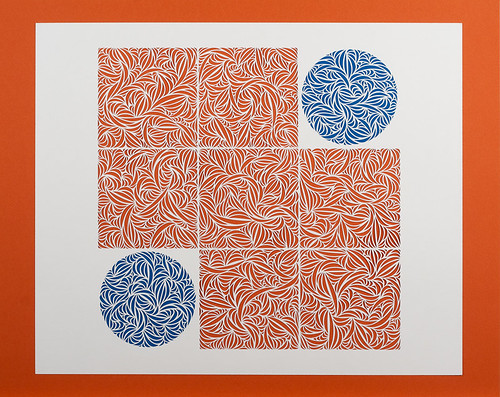
This piece was originally going to be a square made of smaller squares, but as I got closer to completion I felt the idea was really boring. I left the two opposing corner squares uncut for a few weeks while I contemplated what it needed to feel right, and I chose circles over squares.

Keep Apart-3

Keep Apart-4

Looking at this now I begin to wonder whether all of these recent geometric paper cuts would be stronger if they were cut away from the surrounding white paper and floated against the colourful background. Food for thought in the work I create in future. I should mention the colours in real life are not as bright as pictured here.

Keep Apart-2

Keep Apart

The finished piece is 17″ x 14″ cut from Canson drawing paper, and backed with Canson Mi-teintes coloured papers. This is but one of the many new works on display in my show at Kafka opening this Friday.

Paper Cut Work: Intertwine

As I was working on a price list and titles for work in my upcoming show at Kafka, I realized there are a few pieces I haven’t yet shared here. I document everything on Instagram, and sometimes work doesn’t make it beyond there.

There are three pieces I reworked a few weeks (or maybe even months) after I initially felt they were complete, and this is one of those three. I was inspired by an image of intertwined circles I came across on the sidewalk of my neighbourhood, but as a paper cut design it felt rather dull. I went back and added smaller rings within the two larger ones, and then it felt complete.

Intertwine - detail

Intertwine - detail

I was following my fascination with circles at the time, and I would really like to redo this same idea in a different way. I’m happy with this piece but there are things about it I want to do better.

Intertwine - detail

Intertwine

The finished paper cut design is created from 14″ x 17″ Canson drawing paper, backed with red water colour paper. It’s all framed and ready for it’s IRL debut at Kafka next week.

Exhibition: Intricate Intimacy at Kafka

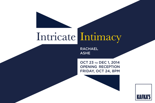
At last I have an invitation and details to share about my upcoming exhibition at Kafka Coffee & Tea. The show is titled, Intricate Intimacy, and it will feature a series of new paper cut pieces, as well as drawings, and small pieces combining both paper cut and drawing.

Intricate Intimacy Postcard2
Intricate Intimacy Postcard1

The show opens Friday October 24th, 8pm to 10pm, with the exhibition continuing until December 1st. There’s a Facebook event page if you’d like to RSVP or share details about this with friends.

Intricate Intimacy
Kafka Coffee & Tea

Opening Friday October 24th, 8pm to 10pm
Dates: October 23rd to December 1st, 2014
Address: 2525 Main Street at Broadway