Paper Cut Work: Wind & Water Series (Part 2)

As mentioned in my previous post, I have two more works to share from the Wind & Water series. Here they are in all their crazy paper cut glory.

I built the series around the repeating pattern of a slender crescent shape, combining them into larger swirls, which in turn create an overall form. Each work is cut from a single sheet of white paper and mounted within a wood cradle panel.

Wind & Water (series)-4
Wind & Water series (3 of 4) 12″ x 12″

Wind & Water (series) - detail

Wind & Water (series) - detail

I will continue to work on this series because I want to further explore layering the cut paper.

Wind & Water (series)
Wind & Water series (3 of 4) 12″ x 12″

Wind & Water (series) - detail

Wind & Water (series) - detail

This work and more can be seen in my upcoming solo show, Currents of Nature. It opens this weekend at Ranger Station Art Gallery in Harrison Hot Springs as part of the 35th Annual Harrison Festival of the Arts.

Make: Cut Paper Typography

After my initial explorations into cut paper typography with the word Art a few weeks ago I decided to choose a few more words to work with. Make goes very well with Art, and after today Create will be added to the series.

Make

Make

To give you a sense of scale this is an 8.5″ x 11″ piece of red card stock, and the letters are between 2.25″ to 3″ high. I create the word in photoshop first, print it out and use this as a template to draw an outline of the letters. All the cutting of shapes is done freehand.

Make

Make

I enjoy trying to form the letters from smaller shapes. It’s actually pretty challenging because I am working so small. I think it’s an excellent exercise to refine my paper cutting technique even further.

Make

Make

Other than the word “Create” can you suggest other short words that would make a good addition to this series? I’m open to requests.

Cut Paper Typography

I’ve long admired the work of Elsa Mora, a Cuban artist living in LA who works in various mediums including paper cutting. I was looking at her website earlier this week as a way to jog my thinking on how to write about my own paper cut work, and came across her new site, Art Is A Way.

Paper cut typography

It’s a lovely little side project of creating artwork using the word Art, and she’s invited people to join her. I don’t normally have much interest in exploring typography in my own work, but the project inspired me to experiment with typography created in my style of cut paper.

Paper cut typography-4

Paper cut typography-3

I chose a font in photoshop, Tamil NM in bold, made it large enough to nicely fill an 8.5″ x 11″ page and printed it out. I used this as a template to trace the outline of the letters first and then freehand cut all shapes. It was really fun to do, and has me pondering more potential work using type.

Paper cut typography-2

Paper cut typography

If you’re interested in creating your own work of the word Art, check out the about page of Art Is A Way for details.

Paper Cut Work: Down the Rabbit Hole

Earlier in the fall I was invited to be part of an upcoming group show in Victoria that explores the theme of Alice in Wonderland/Through the Looking Glass. I hadn’t had any time until last week to figure out and create something new for this show because I don’t currently have anything appropriate. I was stumped and uninspired at first because the theme doesn’t really fit into my current body of work, and I’m reluctant to create one-off pieces just to satisfy the requirements of a group show.

I was actually really close to passing up on this opportunity. But I surprised myself and found my way through to creating work I am very pleased with. The White Rabbit was my inspiration and he took me down a rabbit hole of layers and layers of circles.

Paper Cut Work- Down the Rabbit Hole
“Down the Rabbit Hole” | 10″ x 10″

Paper Cut Work- Down the Rabbit Hole-4

Paper Cut Work- Down the Rabbit Hole-5

Paper Cut Work- Down the Rabbit Hole-3

Paper Cut Work- Down the Rabbit Hole-2

Both of these are 10″ x 10″ with the cut paper mounted inside a wood cradle panel. There are three layers of paper in each one, and I used a compass cutter to cut the circles. I’d been playing around with this idea in my head because I have a circle cut pile of maps left over from a previous project, and I intend to do something with them. The layers work very well and build on my recent work of a single repeating shape.

To create the two rabbit silhouettes I sourced images of the white rabbit from google images, printed these out to the correct size and used them as a template. I left the details of each of them very minimal on purpose.

Paper Cut Work- Down the Rabbit Hole-6
“Down the Rabbit Hole” | 10″ x 10″

Paper Cut Work- Down the Rabbit Hole-9

Paper Cut Work- Down the Rabbit Hole-8

Paper Cut Work- Down the Rabbit Hole-7

I showed photos of these on Instagram as I worked on them last week and was thrilled to have such a positive reaction to the work. I’ll share more details about the show closer to the date next year.

Paper Cut Work: The Universe is Intricate

One of the presents I received for my birthday earlier this year was a lovely white tea cup given to me by Anne. It came in a small wooden box with a hinged lid, and I was attracted to this as much as to the gift it held inside. I knew right away I wanted to use it somehow in my art.

My initial idea was to create a small abstract universe from cut paper inside this box, but as I began working it out I couldn’t manage to achieve what I’d been envisioning in my head. And so it evolved into what you see pictured here.

The Universe is Intricate-2
Front and top view.

The Universe is Intricate
Interior view.

The Universe is Intricate-3
Back and side view.

The box is decorated with some of the cut paper pieces I’d originally created to intertwine inside the box but instead became striking details for the outside. There are two 4.25″ square paper cuts layered a few inches apart in the interior, with the sides painted white to help them stand out. I gave the exterior of the box a light wood stain because I felt the whole thing should have minimal colour.

I shared a work-in-progress photo of this on my Facebook page last week and was intrigued by the various ways people chose to interpret it. Rather than explain my ideas behind this (because it’s intended to fit a certain theme), I’d love to hear your thoughts about the work. I find it fascinating to learn what other people see.

Commissioned Work: Creating a Blog Header for KimWerker.com

I am very happy to finally get the chance to reveal this beautiful paper cut design I was commissioned to create at the end of the summer.

As you can clearly read in the hand cut letters within the composition, this was a custom piece created for Kim Werker. She was in the process of redesigning her website and wanted something unique and handmade to use as the new header. I also helped her with a few other visual parts of her re-design, and moved her over to InMotion Hosting to speed up her website overall. Kim is a writer, editor, creative thinker, and crafter and felt a paper cut piece would be the perfect thing to incorporate into the new site design.

kim-werker-header

We discussed a few ideas but Kim’s only requirements were for something with minimal colour, and for book pages to somehow be the background of the piece.

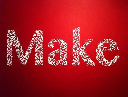
My first step was to choose a font to work with, one that wasn’t too intricate or delicate to cut out by hand, and would read well within the busy design. We both agreed on Hoefler, so I created the text in photoshop and printed it out to use as a template to guide my cutting. I do this by placing the printed text on top of the black card stock and carefully cutting through both.

kim-werker-header

With the text completed I moved onto the rest of the design, all of which I created through freehand cutting. I did a bit of practice work both in my sketchbook and on a separate piece of black card stock before I worked on the final piece. I wanted to work with different shapes rather than a single repeating shape as usual, and needed to get a feel for it first. I cut for hours and came away with a very delicate intricate finished design.

kim-werker-header-2

kim-werker-header-3

kim-werker-header-4

For the background paper I cut down scraps of book pages left over from an altered book project and collaged these together. I wanted the text to flow in all directions and become a detail rather than a feature. The final step was to bring the paper cut and the collage together, and remove the extra card stock.

kim-werker-header-5

kim-werker-header-6

I am very pleased with how beautifully this paper cut design came together, and it looks absolutely stunning as the header on Kim’s new website.

KimWerker.com

New Work At Bird On A Wire Creations

If you love the paper cut collages I’ve been making recently, you can now find four of them at Bird on a Wire Creations on Main Street.

Paper Cut CollagePaper Cut Collage Design
Paper Cut Designs | 8″x 8″ on wood panel

Paper Cut Collage DesignPaper Cut Collage
Paper Cut Designs | 6″x 6″ on wood panel

Go check them out. The work is even more dazzling in person.

Bird on a Wire Creations
2535 Main Street @ East Broadway