Currents of Nature In Situ

My solo show, Currents of Nature, opened this past weekend at the Ranger Station Art Gallery in Harrison. Here are photos of the exhibition:

Currents of Nature, Ranger Station Art Gallery-2

Currents of Nature, Ranger Station Art Gallery

Currents of Nature, Ranger Station Art Gallery-4

Currents of Nature, Ranger Station Art Gallery-3

Currents of Nature, Ranger Station Art Gallery

Currents of Nature, Ranger Station Art Gallery-2

One side of the gallery has altered book work and installations, while the other has recent paper cut sculptures and wall pieces.

Currents of Nature, Ranger Station Art Gallery

Currents of Nature, Ranger Station Art Gallery-2

Currents of Nature, Ranger Station Art Gallery-4

Currents of Nature, Ranger Station Art Gallery-3

Currents of Nature, Ranger Station Art Gallery-3

Currents of Nature, Ranger Station Art Gallery

Currents of Nature, Ranger Station Art Gallery-2

Currents of Nature, Ranger Station Art Gallery-4

Thanks to my friend Siobhan Humston for making the installation process so smooth and easy. All of the work was in position within two hours of my arrival at the gallery, and the show looks terrific.

Currents of Nature, Ranger Station Art Gallery

Currents of Nature will be on display until July 28th as part of the Harrison Festival of the Arts, so please do visit the show.

Paper Cut Work: Wind & Water Series (Part 2)

As mentioned in my previous post, I have two more works to share from the Wind & Water series. Here they are in all their crazy paper cut glory.

I built the series around the repeating pattern of a slender crescent shape, combining them into larger swirls, which in turn create an overall form. Each work is cut from a single sheet of white paper and mounted within a wood cradle panel.

Wind & Water (series)-4
Wind & Water series (3 of 4) 12″ x 12″

Wind & Water (series) - detail

Wind & Water (series) - detail

I will continue to work on this series because I want to further explore layering the cut paper.

Wind & Water (series)
Wind & Water series (3 of 4) 12″ x 12″

Wind & Water (series) - detail

Wind & Water (series) - detail

This work and more can be seen in my upcoming solo show, Currents of Nature. It opens this weekend at Ranger Station Art Gallery in Harrison Hot Springs as part of the 35th Annual Harrison Festival of the Arts.

Paper Cut Work: Wind & Water Series

I’ve been holding back on sharing a collection of recent paper cut work because until yesterday, I just hadn’t gotten around to photographing it all properly. I find it tricky to photograph the paper cut work, to capture the layers and textures, and make it readable to the viewers eye.

The two pieces included in this post are part of a series of four. I’ve decided to title them Wind & Water because their patterns remind me of both the ripples and eddies of water, and the billows of smoke and clouds.

Wind & Water-3
Wind & Water series (1 of 4) 12″ x 12″

Wind & Water-2

Wind & Water

Each piece is cut from a single sheet of white paper and mounted within a wood cradle panel. I’ve shared the work below in a previous post but wanted to place it in the context of the rest of the series.

Wind & Water-4
Wind & Water series (2 of 4) 12″ x 12″

Wind & Water-5

Wind & Water-6

I’ll share the other two from the series in a separate post. This work will be on display in my upcoming exhibition, Currents of Nature, opening this weekend at the Ranger Station Gallery in Harrison Hot Springs.

Paper Inspiration For Your Friday

On Pinterest I have a board called, Paper Inspiration, where I collect all sorts of paper-based art work, installations, and sculpture. (Follow it here if you’re interested).

Some of the recent work I’ve come across to inspire me:

Kirigami by  Kanako Yaguchi

Kirigami by Kanako Yaguchi


Paper Sculpture by Jacqueline Rush Lee

Paper Sculpture by Jacqueline Rush Lee


Paper Cut illustration by Nicola Moss

Paper Cut illustration by Nicola Moss


Paper cut work by Pablo Lehmann

Paper cut work by Pablo Lehmann


It’s pretty amazing what a skilled artist can do with a simple piece of paper.

Snapfish Photo Books as Portfolio

One thing I’ve been wondering lately is whether or not an artist still needs to maintain a print version of their portfolio or does digital suffice. I have no idea what the right answer to this is, but I decided it couldn’t hurt to have something in print. Rather than doing this photographically and inserting the prints into a a traditional (but boring) black portfolio case with plastic sleeves, I decided to make a digitally printed photo book.

I chose Snapfish because it came recommended by my friend Valerie Arntzen. She uses the service to print books on an annual basis to keep a record of the work she’s created over the course of each year.

Snapfish book-5

Snapfish book

Snapfish has a good variety of formats and sizes for their photo books. I chose the 5″ x 7″ Everyday Book, which costs $12.99 per copy and comes with a paper cover in your choice of colour. The book layout is created by using a browser-based interface, which takes a bit of experimenting with to get a feel for, but is fairly easy to use.

Snapfish book-3

Snapfish book-2

A big reason I chose Snapfish over other photo book services is because they have a Canadian website and reasonable prices for shipping to Canada. I had my books within a week of ordering, and the shipping cost $10. I’ve used Blurb Books in the past and their shipping costs were higher and the order took longer to arrive.

Snapfish book-4

The print quality is excellent, and the work looks good and reads well despite the small size of the pages. I’m very happy with these little books and will definitely use Snapfish again to make more printed collections of my work.

When Work Goes Awry

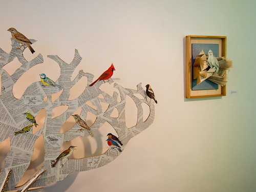
The saying goes, “when life hands you lemons, make lemonade”. But what should an artist do when a piece of art with hours of work already invested into it starts turning to lemons?

I don’t often find myself in this type of situation because I am a process-driven artist and I don’t have a specific result in mind from the start. I am interested to see how something will evolve as I work. But once in awhile things still go awry.

Paper Cut Vessel

Paper Cut Vessel - Cylinder

The two cut paper vessels that I’m sharing in this blog post began life as a single piece of 19″ x 25″ black paper. My intention was to make a large rectangular structure I could hang from the wall. The more I worked on it, the less I liked it. I realized I was happy with the paper cutting but the structure was too boring. It also reminded me too much of a decorative designery thing for candles that someone would buy from Crate & Barrel.

Paper Cut Vessel - Cylinder

Paper Cut Vessel - detail

I decided to salvage the situation by cutting the paper in half with the idea I would create smaller individual structures from each piece. I couldn’t leave it as one piece because I’d already scored the paper for folding into a rectangle.

Paper Cut Vessel - detail

I’d left an uncut edge along one side of each piece so I could attach a piece of paper and create a bottom to the structure. The first strip of cut paper became a wide cylindrical shape. It’s about eight inches in diameter and nine inches at the tallest point.

Paper Cut Vessel - Three Curves

Paper Cut Vessel - Three Curves

With the second strip of cut paper I decided to aim for an irregular structure. I had the piece of paper curve around three circles as the bases and wound up with what you see here. It was an experiment, and the end result is a bit wonky but interesting.

Paper Cut Vessel - Three Curves

Paper Cut Vessel - Three Curves

As a side note, the paper I used for these was a bit lighter than I normally work with and I think it may be a bit too delicate for creating more structural pieces. Working with black was also a nice change from all the white I’ve been doing lately.

Paper Cut Vessel - Three Curves

Thank goodness this piece was flexible enough to salvage and transform into something else. I think what I’ve ended up with has turned out to be much more interesting than my original idea.

Elegant Instruments in Paper

Over the past few weeks I’ve been preparing for my upcoming solo show in July at the Ranger Station Gallery in Harrison Hot Springs. The exhibition is one part of the annual Harrison Festival of the Arts, which includes an art market, workshops, and plenty of live music.

Paper Violin

It’s this musical aspect of the festival that has led me to create more instruments from paper. My friend Siobhan, a musician as well as a visual artist, loaned me a violin and a tambourine to use as reference. The violin proved to be a much trickier object than an acoustic guitar to puzzle out and reproduce as a three dimensional object in paper.

Paper Violin & real violin

The tambourine was relatively simple by comparison. What I like best about making instruments from paper are the problem solving skills that kick in as I try to puzzle out how emulate some piece of the object normally carved from wood, or made from metal.

Tambourine

I will be making one final instrument for the show, a mandolin. I’m really hoping it will be easier to reproduce than the violin.

Create: Cut Paper Typography

First there was Art. Next was Make. Now here is also the word Create as cut paper typography. Little did I realize when I started that this would become a series, but creating words is a bit addictive.

Untitled

Untitled

As with the previous two words, Create was freehand cut from a piece of 8.5″ x 11″ red card stock.

Untitled

Untitled

Untitled

All of the cut paper typography work is available as a print, iPhone case, and more through Society6.

Paper Cut Work: Wisps

I’ve been busy working on exhibition proposals for possible shows in the next two years, and it’s been a great excuse to project farther into the future with my work. I really want the paper cut work to be three dimensional and my initial explorations led me to the structural/sculptural pieces I shared last month. But I also started thinking about ways to play with layers, and shadows within framed work.

Here’s what I’ve come up with so far:

untitled
Wisps, 2013 – 12″ x 12″ cut paper in cradle panel

Using the inside of a wood cradle panel as my frame, I sanded and painted it with a light wash of white. I cut the three strips that make up this piece separately from the one piece of paper and all are attached by a tab of paper at the top and bottom. The middle piece is slightly deeper in the frame than the others.

Paper Cut Work- Wisps

Paper Cut Work- Wisps-3

These are just some quick photos so the lighting isn’t quite right, but this way of integrating the paper cuts into the frame creates more depth. This is important to me because I wanted room for the paper cut pieces to cast interesting shadows, which will vary depending on the lighting.

Paper Cut Work- Wisps-2

With each new exploration I feel like I’m getting closer to where I want to be with the paper cutting work.

Make: Cut Paper Typography

After my initial explorations into cut paper typography with the word Art a few weeks ago I decided to choose a few more words to work with. Make goes very well with Art, and after today Create will be added to the series.

Make

Make

To give you a sense of scale this is an 8.5″ x 11″ piece of red card stock, and the letters are between 2.25″ to 3″ high. I create the word in photoshop first, print it out and use this as a template to draw an outline of the letters. All the cutting of shapes is done freehand.

Make

Make

I enjoy trying to form the letters from smaller shapes. It’s actually pretty challenging because I am working so small. I think it’s an excellent exercise to refine my paper cutting technique even further.

Make

Make

Other than the word “Create” can you suggest other short words that would make a good addition to this series? I’m open to requests.