Paper Cut Work: Wind & Water Series (Part 2)

As mentioned in my previous post, I have two more works to share from the Wind & Water series. Here they are in all their crazy paper cut glory.

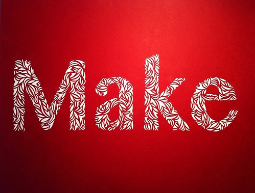
I built the series around the repeating pattern of a slender crescent shape, combining them into larger swirls, which in turn create an overall form. Each work is cut from a single sheet of white paper and mounted within a wood cradle panel.

Wind & Water (series)-4
Wind & Water series (3 of 4) 12″ x 12″

Wind & Water (series) - detail

Wind & Water (series) - detail

I will continue to work on this series because I want to further explore layering the cut paper.

Wind & Water (series)
Wind & Water series (3 of 4) 12″ x 12″

Wind & Water (series) - detail

Wind & Water (series) - detail

This work and more can be seen in my upcoming solo show, Currents of Nature. It opens this weekend at Ranger Station Art Gallery in Harrison Hot Springs as part of the 35th Annual Harrison Festival of the Arts.

Make: Cut Paper Typography

After my initial explorations into cut paper typography with the word Art a few weeks ago I decided to choose a few more words to work with. Make goes very well with Art, and after today Create will be added to the series.

Make

Make

To give you a sense of scale this is an 8.5″ x 11″ piece of red card stock, and the letters are between 2.25″ to 3″ high. I create the word in photoshop first, print it out and use this as a template to draw an outline of the letters. All the cutting of shapes is done freehand.

Make

Make

I enjoy trying to form the letters from smaller shapes. It’s actually pretty challenging because I am working so small. I think it’s an excellent exercise to refine my paper cutting technique even further.

Make

Make

Other than the word “Create” can you suggest other short words that would make a good addition to this series? I’m open to requests.

Cut Paper Typography

I’ve long admired the work of Elsa Mora, a Cuban artist living in LA who works in various mediums including paper cutting. I was looking at her website earlier this week as a way to jog my thinking on how to write about my own paper cut work, and came across her new site, Art Is A Way.

Paper cut typography

It’s a lovely little side project of creating artwork using the word Art, and she’s invited people to join her. I don’t normally have much interest in exploring typography in my own work, but the project inspired me to experiment with typography created in my style of cut paper.

Paper cut typography-4

Paper cut typography-3

I chose a font in photoshop, Tamil NM in bold, made it large enough to nicely fill an 8.5″ x 11″ page and printed it out. I used this as a template to trace the outline of the letters first and then freehand cut all shapes. It was really fun to do, and has me pondering more potential work using type.

Paper cut typography-2

Paper cut typography

If you’re interested in creating your own work of the word Art, check out the about page of Art Is A Way for details.

Work-In-Progress Paper Cut

Last week I mentioned beginning work on larger paper cut work, and this is the second of the two. The paper size is approximately 19″ x 24″ and is a thinner stock than the grey paper I was working with last week to create the flower shaped paper cut.

I’m enjoying working with the basic crescent shape and having the design flow around the page. Sometimes they become tornados, then seashells, and morph into imaginary microscopic organisms.

When I’d cut away about a quarter of the paper I came close to calling it quits because it seemed like an impossible amount of surface area to work with. I was overwhelmed because I don’t normally work this large. I’ve managed to push past that phase and will obsessively cut away paper until I reach the end.