On Pinterest I have a board called, Paper Inspiration, where I collect all sorts of paper-based art work, installations, and sculpture. (Follow it here if you’re interested).
Some of the recent work I’ve come across to inspire me:
Kirigami by Kanako Yaguchi
Paper Sculpture by Jacqueline Rush Lee
Paper Cut illustration by Nicola Moss
Paper cut work by Pablo Lehmann
It’s pretty amazing what a skilled artist can do with a simple piece of paper.
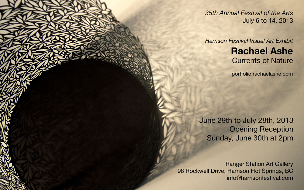
Currents of Nature is a mix of new works in abstract cut paper sculpture as well as installation works made from repurposed books, all inspired by elements of the natural world.
Please join me on Sunday June 30th, between 2pm to 4pm, for the opening reception of Currents of Nature. I will be in attendance and look forward to seeing you there. The exhibition continues at the Ranger Station Art Gallery until Sunday July 28th.
Currents of Nature Date: June 30th to July 28th, 2013 Opening: Sunday June 30th, 2pm to 4pm Location: Ranger Station Art Gallery Address: 98 Rockwell Drive, Harrison Hot Springs, BC
The Hot Talks series continues in June at Hot Art Wet City with our latest speaker, Bruce Alcock. In his professional life Bruce is the Creative Director of Global Mechanic, as well as an award winning film maker and animator with a passion for music and fine art.
I’m intrigued by the description of Bruce’s talk (below), and think it builds very nicely upon the themes explored by our first speaker in the series, Kim Werker. (Listen to her talk online if you missed it previously).
Your Self Out There:
Walking the spectrum from bullshit to truth in the creative life
From waiting tables to making art to advertising Coca-cola, Bruce Alcock looks over the last 25 years to examine who he is when he’s at home, or at a meeting table, or managing staff, or standing up and talking to a group of people in a gallery. Is client interaction performance, or are you simply who you are? In this age of digital self-representation, does your private identity change to sync with your public identity? The Onion’s headline “I am a Brand, Pathetic Man Says” points to empty self-representation, but any time you put yourself out there, you’re creating a persona that reflects your assumptions about the people you’re talking to, or working for, or just passing time with. From small talk (excruciating) to work talk (boring?) to letting out your inner beast, or weenie, or feather boa, what’s real and what’s not, what works, and what can you live with?
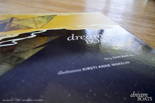
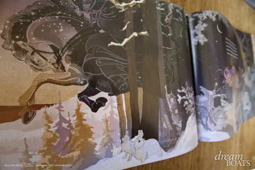
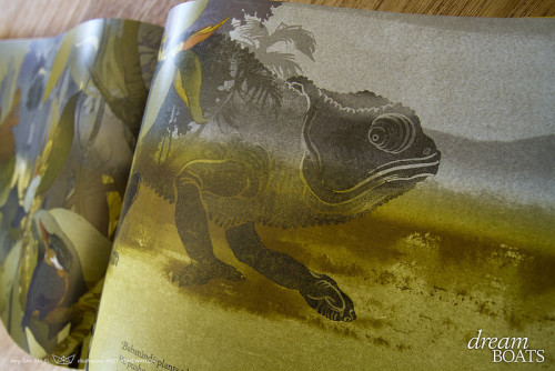
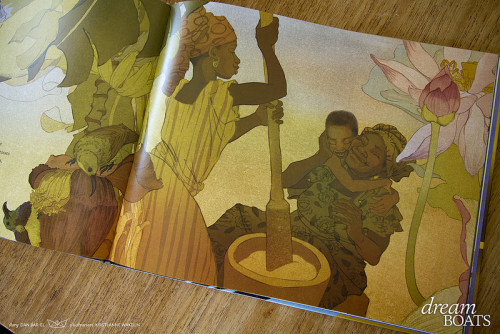
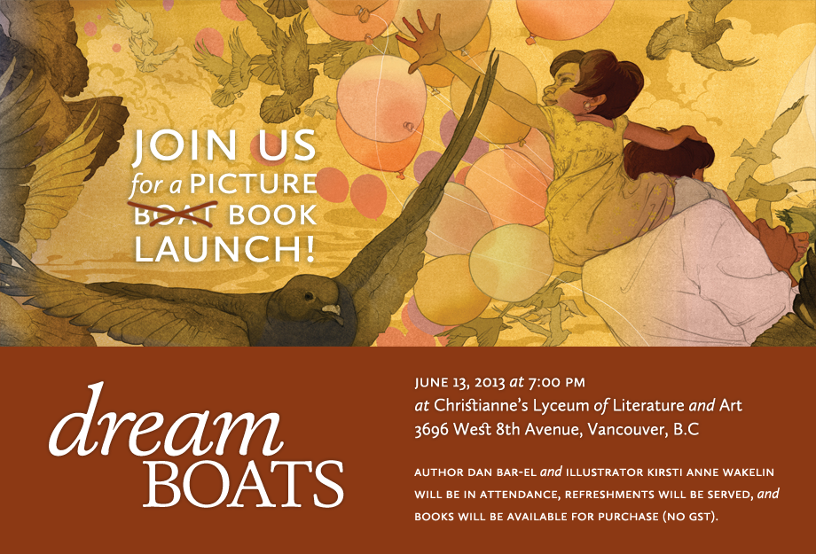
Dream Boats is the beautiful new children’s book illustrated by Kirsti Anne Wakelin and written by Dan Bar-el. I’ve been following the progress of the development of this book for the last few years, and can hardly wait to get my hands on a copy. The illustrations are lush, finely detailed, and filled with imagery to stimulate the imagination.
Take a look for yourself, and I’m sure you’ll agree.
Where do children go when they close their eyes to sleep?
They step onto their dreamboats and sail toward adventure.
From Maiqui in the Andes floating through the constellations, to Aljuu paddling along the shores of Haida Gwaii with Eagle, Orca and Black Bear, to Ivan sailing into St. Petersburg, then sneaking between the bony legs of Baba Yaga, stories and memories lead them on.
Dream Boats takes readers into the dreams of children around the world, dreams that are filled with family and legends, culture and love.
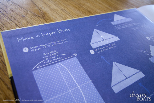
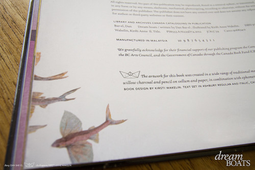
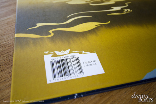
There are so many lovely details to this book. From the end pages filled with instructions on how to fold your own paper boat, to the flying fish swooping off the credits page, and the beautifully designed barcode on the back of the book.
Dream Boats has its official launch next Thursday June 13th at Christianne’s Lyceum of Literature & Art in Vancouver. Dan and Kirsti will be in attendance, and copies of the books will be available for purchase.
One thing I’ve been wondering lately is whether or not an artist still needs to maintain a print version of their portfolio or does digital suffice. I have no idea what the right answer to this is, but I decided it couldn’t hurt to have something in print. Rather than doing this photographically and inserting the prints into a a traditional (but boring) black portfolio case with plastic sleeves, I decided to make a digitally printed photo book.
I chose Snapfish because it came recommended by my friend Valerie Arntzen. She uses the service to print books on an annual basis to keep a record of the work she’s created over the course of each year.
Snapfish has a good variety of formats and sizes for their photo books. I chose the 5″ x 7″ Everyday Book, which costs $12.99 per copy and comes with a paper cover in your choice of colour. The book layout is created by using a browser-based interface, which takes a bit of experimenting with to get a feel for, but is fairly easy to use.
A big reason I chose Snapfish over other photo book services is because they have a Canadian website and reasonable prices for shipping to Canada. I had my books within a week of ordering, and the shipping cost $10. I’ve used Blurb Books in the past and their shipping costs were higher and the order took longer to arrive.
The print quality is excellent, and the work looks good and reads well despite the small size of the pages. I’m very happy with these little books and will definitely use Snapfish again to make more printed collections of my work.
A few photos from a lovely long weekend on Bowen a week and a half ago. It was a good time for bird watching, as you can see from some of the photos.
There were two Anna’s Hummingbirds constantly visiting the feeder. The view of them was excellent since it’s located just outside the window beside the kitchen table. They are amazing little birds.
The Canada Geese had taken over the Lagoon with their horde of goslings. There were at least thirty of them in one group, watched over by multiple parents. Gosling daycare I suppose.
Bowen Island a place where there are lovely things to see, rain or shine.
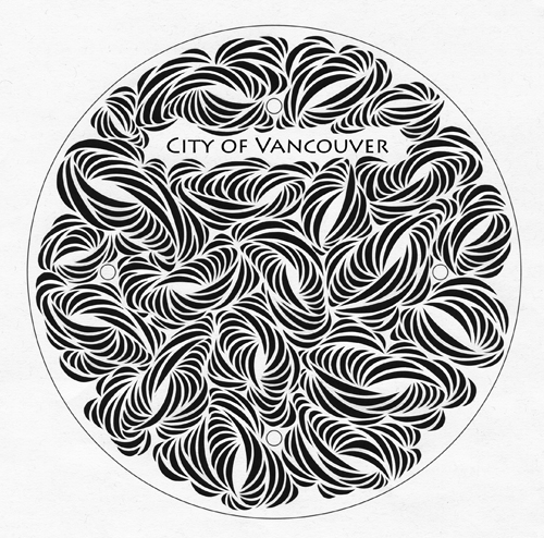
Ironclad Art is a competition put on by the City of Vancouver challenging people to come up with new manhole cover designs. As of the deadline in mid-April they received over one thousand submissions, all of which you can view online. Last week I was pleased to learn my work was selected as one of the top twenty-five finalists. Woot!
I chose to create one of my intricate paper cut designs (pictured here), and I would dearly love to see this immortalized in metal. Even if it isn’t chosen as the finalist, it’s still pretty cool to make the shortlist.
As part of the competition there is a People’s Choice award. Please help me out and vote for my design. Winners of Ironclad Art will be announced this Saturday June 1st. I can hardly wait.
The speaker series I am curating at Hot Art Wet City gallery kicked off last Tuesday evening with a talk by Kim Werker. It was a terrific talk centered around the value of failure and imperfection which led to an interesting discussion afterwards.
Lucky for those who missed it, Chris filmed the whole thing and you can watch it here:
The series, now titled Hot Talks, continues on June 25th with Bruce Alcock. More details about it, and to grab tickets, on the Hot Art Wet City web site.
Last week I attended an artist talk by Barbara Cole at Bau-xi Gallery, and it has left me with a whole jumble of different thoughts. I’m hoping I can sort out at least a few points here.
Barbara Cole is a fine art photographer I have admired since my days in Toronto. She creates dream-like imagery of the female form, and over the last ten or so years has been focused on underwater photography.
In her artist talk she took the audience all the way back to the beginnings of her career, and how through luck and circumstances she ended up as fashion editor for the Toronto Sun. Cole told this hilarious story of her very first assignment with the Sun, which was to cover Fashion Week in Paris. An unfortunate miscommunication left her without proper access to any of the shows, so at twenty years old she had to come up with a solution and boldly make her way, or risk not meeting deadlines and failing.
What I loved most about Barbara Cole’s talk was her willingness to admit most of the time she didn’t know what she was doing. Few people will admit to this publicly because it puts them in a vulnerable place, but really most of us don’t know what we’re doing more than half of the time. I wish more people would make this statement so we can all be okay with it. It’s not a bad thing to not know what you’re doing because this is an opportunity for learning. Cole’s solution to her lack of knowledge was exactly this: she simply taught herself what she needed to know.
Much of what was said by Barbara Cole was a good reminder of the value of learning by doing. She has done it for her entire career and it has served her well. As a self-taught artist I sometimes feel insecure about my abilities, as if they are less valid than someone who has an MFA or BFA in fine art. But then I realize even the most educated of artists needs to buckle down and go beyond what they’ve learned in school in order to fully evolve as an artist. I skipped art school (which would not have been a good fit for me) and went straight to the in-studio professional development phase of my artistic career. My work has matured by leaps and bounds over the last few years because of this dedication.
I admired Cole’s work before the talk, but now I think highly of her as a woman. She’s in her fifties, but comes across as a much younger person. She’s had a long and distinguished career, continues to create inspiring work, and explores new aspects of her fascination with underwater photography. Barbara Cole comes across as someone content with her life, relaxed with who she is.
It was refreshing to be in the presence of a confident woman. And perhaps it is this most of all I walked away with from the talk. The idea of not just the artistic career I aspire to, but the type of woman I want to be as I get older.
In my monthly newsletter I always share three or four links to items I’ve come across that have inspired me. I call the section, “Found Objects”, and I’ve decided to try and continue the same thing here on my blog.
For your May long weekend reading pleasure, I present a few items you should check out:
Mixed media artist, Carlyn Yandle, writes one blog post a week about art. Each one is well-written, thoughtful, and insightful.
Money Money Money, a series of blog posts by Kim Werker on money struggles for the creative person. It was inspired by a letter I wrote to her.
A beautiful post about body image and confidence by Vivienne McMaster. It speaks strongly to how women tear themselves down, but can also build themselves up.